Last updated on October 31st, 2025 at 09:10 am
Your profile picture is more than just a photo — it’s your first impression in the digital world. Whether you’re trying to build a personal brand, attract followers, or simply stand out online, the colors you choose play a surprisingly big role in how people perceive you. That’s where color psychology comes in. By understanding the emotional power of colors, you can create a profile image that not only looks great but also reflects your personality and purpose.
In this article, we’ll explore how to use color psychology when you design a profile picture, what each color communicates, and how to balance tones for maximum impact. Let’s dive in.
What Is Color Psychology?
Color psychology is the study of how different colors affect human emotions, behavior, and perceptions. Each shade has its own emotional association — some colors create feelings of trust and calmness, while others inspire energy, excitement, or creativity.
When it comes to your profile picture, these associations matter more than you think. In just a few seconds, viewers subconsciously form opinions about your personality and professionalism. A wisely chosen color palette can help you appear more approachable, confident, and credible.
Why Color Choice Matters in a Profile Picture
Think about the last time you came across a striking profile image. Chances are, the colors stood out. Color isn’t just about beauty; it’s a silent communicator. It sets the tone for how others perceive you before they even read your bio.
Here’s why your color selection matters when you design your profile picture:
- Instant Emotional Connection – The right color can create a positive emotional bond within seconds.
- Brand Consistency – Using colors that match your brand or niche makes your profile look cohesive and professional.
- Attention-Grabbing Effect – Bright or contrasting colors help you stand out in crowded feeds.
- Reflects Personality – Every color tells a story. Choosing the right one helps express who you are.
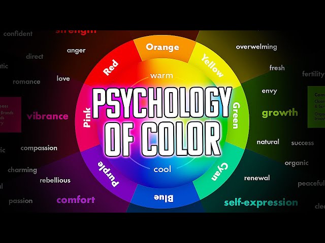
The Psychology Behind Popular Colors
Let’s break down the meaning and impact of different colors so you can decide which fits best with your goals.
1. Blue – Trust, Calmness, and Reliability
Blue is one of the most popular choices for profile images because it evokes trust, loyalty, and peace. It’s ideal for professionals, business owners, and creators who want to appear dependable and confident.
- Best for: LinkedIn, business profiles, consultants, or coaches.
- Tip: Combine light blue for calmness or navy for authority.
2. Red – Passion, Power, and Energy
Red grabs attention instantly. It’s associated with boldness, confidence, and action. However, it can also seem intense if overused.
- Best for: Influencers, artists, or anyone who wants to make a strong first impression.
- Tip: Use red accents instead of a full red background to maintain balance.
3. Yellow – Optimism, Warmth, and Positivity
Yellow radiates happiness and creativity. It’s great for personalities who want to appear friendly, joyful, and approachable.
- Best for: Creators, lifestyle influencers, or motivational pages.
- Tip: Pair it with neutral tones (like white or grey) to avoid overwhelming brightness.
4. Green – Balance, Growth, and Health
Green symbolizes nature, growth, and harmony. It’s often linked with wellness, sustainability, and renewal.
- Best for: Health coaches, nature enthusiasts, or eco-conscious brands.
- Tip: Use soft or muted greens for a calm look; bright greens for energy.
5. Purple – Creativity, Luxury, and Wisdom
Purple has long been associated with royalty and imagination. It communicates sophistication and artistic flair.
- Best for: Designers, artists, or spiritual profiles.
- Tip: Combine with silver or gold tones for an elegant touch.
6. Black – Strength, Elegance, and Authority
Black is timeless, sleek, and powerful. It’s ideal if you want to project confidence, mystery, or luxury.
- Best for: Entrepreneurs, photographers, or fashion brands.
- Tip: Use contrast (like white text or background) to maintain visual clarity.
7. White – Simplicity, Purity, and Modernity
White gives a clean, minimal look that focuses attention on your face. It conveys honesty and simplicity.
- Best for: Professionals, lifestyle coaches, or tech experts.
- Tip: Avoid plain white backgrounds — add subtle gradients or soft tones for depth.
8. Pink – Kindness, Creativity, and Approachability
Pink gives off a gentle, compassionate, and playful vibe. It works beautifully for personal brands that highlight positivity or creativity.
- Best for: Beauty, fashion, or wellness creators.
- Tip: Use pastel pinks for warmth or hot pinks for boldness.
9. Orange – Enthusiasm, Confidence, and Energy
Orange combines the warmth of red and joy of yellow, creating a friendly, confident energy.
- Best for: Entrepreneurs, marketers, or lifestyle bloggers.
- Tip: Pair it with navy or charcoal for a balanced, modern contrast.
Matching Colors to Your Personal Brand
Your profile picture should reflect not only your personality but also your purpose. Ask yourself these questions before deciding on a palette:
- What do I want people to feel when they see my profile?
- Am I aiming to look professional, creative, or friendly?
- What are my brand’s main colors (if any)?
For example:
A life coach might choose yellow or green for warmth and growth.
A graphic designer could lean toward purple or orange for creativity.
A corporate professional may prefer blue or grey for reliability.
When you design your profile picture, consider blending multiple shades. You can use a calm background with a bright accent (like your shirt or logo) to draw attention to your face while maintaining balance.
Using Background and Contrast Effectively
Your background color is just as important as the colors in your outfit or logo. It should make your face stand out, not blend in.
Here’s how to use color contrast wisely:
- Use light backgrounds with dark clothing or features.
- Use dark backgrounds if you’re wearing light colors.
- Add gradient backgrounds for a modern, dimensional feel.
- Avoid using the same tone as your skin or hair — it reduces visual clarity.
If you’re not sure which colors complement you best, use a profile picture maker or color tool that lets you experiment with different backgrounds before finalizing.
Color Harmony Tips for a Balanced Look
- Use the 60-30-10 Rule: 60% primary color (background), 30% secondary (clothing), 10% accent (details).
- Avoid Too Many Colors: Stick to 2–3 main tones for a clean, polished appearance.
- Match Lighting to Mood: Warm lighting enhances cozy tones; cool lighting highlights professional looks.
- Test Across Platforms: What looks great on Instagram may look different on LinkedIn — adjust brightness accordingly.
Tools to Help You Design Your Perfect Color Profile Picture
You don’t need to be a designer to create a stunning image. Many profile picture maker tools allow you to preview colors, apply filters, and test backgrounds easily. Look for features like:
- AI background removal
- Color palette suggestions
- Lighting adjustment
- Professional templates
Experiment until you find a combination that truly feels like you.
Final Thoughts
Colors are silent storytellers. The shades you choose for your profile picture can shape how others see you — friendly, professional, bold, or creative. By using color psychology strategically, you can send the right message before saying a single word.
Whether you’re building your brand or simply updating your social profile, take time to explore colors that reflect your energy and goals. With the right balance and thoughtful design, your profile image can become a powerful part of your personal identity.
So, next time you design your profile picture, don’t just think about poses or lighting — think about color. It’s the secret ingredient that makes your image not only beautiful but unforgettable.